
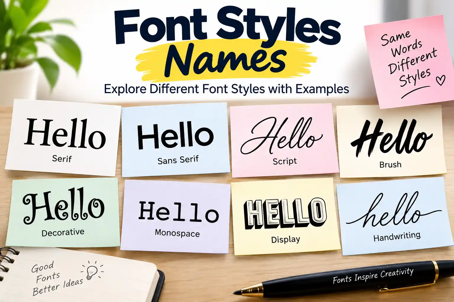
Font Styles Names: 100+ Different Font Styles, Names, Types and Examples
Choosing the right font can completely change the way words look and feel. A simple sentence can appear formal, modern, playful, elegant, handwritten, or bold depending on the typeface used.
If you are looking for font styles names, you may want to identify a font for a school project, presentation, website, logo, invitation, social media post, poster, or creative design. Understanding the names and categories of fonts makes it much easier to choose one that fits your purpose.
This guide explains the most common font styles names, different types of fonts, popular examples, their uses, and how to choose the right style for your project. It is also useful for students and beginners who are learning typography and graphic design.
Table of Contents
- What Are Font Styles?
- Font Style Names List
Different Types of Font Styles
-
- Serif Fonts
- Sans-Serif Fonts
- Script Fonts
- Handwriting Fonts
- Display Fonts
- Monospace Fonts
- Slab Serif Fonts
- Decorative Fonts
- Font Styles Names for Students
- Popular Font Names and Their Styles
- Font Styles for Different Uses
- Font Style vs Font Family
- Font Style vs Font Weight
- How to Choose the Right Font Style
- Best Fonts for School Projects
- Best Fonts for Websites
- Best Fonts for Headings
- Best Fonts for Formal Documents
- Common Mistakes When Choosing Fonts
- Frequently Asked Questions
- Conclusion
What Are Font Styles?
Font styles are different visual designs used to display letters, numbers, and other characters. A font can have a traditional appearance, a clean modern look, a handwritten appearance, or a highly decorative design.
For example, Times New Roman has a traditional serif appearance, while Arial has a clean sans-serif design. Courier New has a fixed-width appearance, whereas a font such as Pacifico has a casual script style.
It is useful to understand one small distinction: people often use the words font and typeface interchangeably, but they are not exactly the same in typography. A typeface refers to the overall design family, while a font traditionally refers to a particular version or style within that family.
For everyday work, however, searching for a “font style name” usually means finding the name and visual category of a typeface.
Font Style Names List
Here is a quick list of widely recognized font style categories:
| Font Style | Main Characteristic | Common Uses |
| Serif | Small finishing strokes | Books, documents, newspapers |
| Sans-Serif | Clean letters without serifs | Websites, apps, presentations |
| Script | Flowing or calligraphic appearance | Invitations, logos, creative designs |
| Handwriting | Looks like natural handwriting | Notes, posters, personal designs |
| Display | Designed to attract attention | Posters, titles, advertisements |
| Monospace | Each character has equal width | Coding, technical documents |
| Slab Serif | Heavy, block-like serifs | Posters, branding, headlines |
| Decorative | Highly stylized appearance | Themes, posters, creative projects |
These categories contain thousands of individual typefaces.
Different Types of Font Styles
1. Serif Fonts
Serif fonts have small strokes or extensions at the ends of letters. They are associated with traditional publishing and are commonly seen in books, newspapers, academic documents, and formal designs.
Some popular serif font names include:
- Times New Roman
- Georgia
- Garamond
- Baskerville
- Cambria
- Merriweather
- Lora
- Playfair Display
- Libre Baskerville
- Source Serif
Serif fonts can communicate a classic, trustworthy, academic, or sophisticated feeling.
Where Are Serif Fonts Used?
Serif fonts are often suitable for:
- School assignments
- Academic documents
- Books
- Newspapers
- Magazines
- Formal invitations
- Editorial websites
- Traditional branding
For long printed passages, a well-designed serif can provide a comfortable reading experience. However, readability depends on the particular typeface, size, spacing, and medium rather than the category alone.
2. Sans-Serif Fonts
The word “sans” means “without,” so sans-serif fonts are typefaces without the small finishing strokes associated with serif fonts.
They are widely used in digital interfaces because many have a clean and straightforward appearance.
Popular sans-serif font names include:
- Arial
- Helvetica
- Calibri
- Verdana
- Tahoma
- Roboto
- Open Sans
- Inter
- Lato
- Montserrat
- Poppins
- Oswald
- Raleway
Where Are Sans-Serif Fonts Used?
Sans-serif fonts are popular for:
- Websites
- Mobile applications
- Presentations
- School projects
- Business documents
- User interfaces
- Logos
- Social media graphics
They are especially useful when you want a simple, contemporary appearance.
Modern sans-serif typefaces can also have different personalities. A geometric sans-serif may look precise and modern, while a humanist sans-serif can feel warmer and more approachable.
3. Script Fonts
Script fonts are designed to resemble handwriting, calligraphy, or lettering created with a pen or brush.
Some well-known script-style font names include:
- Pacifico
- Lobster
- Great Vibes
- Dancing Script
- Allura
- Alex Brush
- Satisfy
- Sacramento
- Parisienne
- Cookie
Script fonts can add personality and elegance to a design, but they are generally better suited to short pieces of text than long paragraphs.
Where Are Script Fonts Used?
Script fonts work particularly well for:
- Wedding invitations
- Greeting cards
- Signatures
- Logos
- Posters
- Creative headings
- Beauty and fashion designs
- Decorative social media graphics
A common mistake is using a complicated script font for an entire paragraph. The decorative letterforms can make longer passages difficult to read.
4. Handwriting Fonts
Handwriting fonts imitate the appearance of handwritten text. Unlike formal calligraphic scripts, handwriting fonts can range from neat and casual to playful and informal.
Examples include:
- Caveat
- Patrick Hand
- Permanent Marker
- Indie Flower
- Kalam
- Comic Sans MS
- Shadows Into Light
- Amatic SC
- Schoolbell
- Handlee
These fonts are particularly useful when a project needs a personal or informal touch.
Uses of Handwriting Fonts
You can use handwriting fonts for:
- Student notes
- Posters
- Children’s materials
- Personal invitations
- Creative worksheets
- Journals
- Scrapbook designs
- Informal social media graphics
For schoolwork, handwriting fonts should be used carefully. If the assignment has formatting requirements, follow the teacher’s instructions instead of choosing a decorative font simply because it looks attractive.
5. Display Fonts
Display fonts are designed primarily to attract attention. Their letterforms can be bold, unusual, artistic, condensed, wide, futuristic, vintage, or highly expressive.
Popular display font names include:
- Bebas Neue
- Anton
- Impact
- Abril Fatface
- Bangers
- Alfa Slab One
- Cinzel Decorative
- Cooper Black
- Fredoka
- Righteous
Display fonts are most effective when used at larger sizes.
Where Are Display Fonts Used?
They are commonly used for:
- Poster titles
- Movie-style graphics
- Advertisements
- Event banners
- YouTube thumbnails
- Magazine headlines
- Brand campaigns
- Creative presentations
A display typeface that looks excellent in a short headline may become tiring to read when used for several paragraphs.
6. Monospace Fonts
In a monospace typeface, characters occupy the same horizontal amount of space. This is different from proportional fonts, where letters such as “i” and “m” can occupy very different widths.
Common monospace font names include:
- Courier New
- Consolas
- Monaco
- Menlo
- Fira Code
- JetBrains Mono
- Source Code Pro
- IBM Plex Mono
- Roboto Mono
- Space Mono
Monospace fonts are strongly associated with programming and technical work.
Where Are Monospace Fonts Used?
They are useful for:
- Programming
- Code editors
- Terminal interfaces
- Technical documentation
- Screenplays
- Data tables
- Developer tutorials
- Typewriter-inspired designs
Modern coding fonts may also include programming ligatures, which can combine certain character sequences visually without changing the underlying code.
7. Slab Serif Fonts
Slab serif fonts have prominent, often thick and block-like serifs. They can feel strong, sturdy, confident, or vintage.
Examples include:
- Rockwell
- Roboto Slab
- Arvo
- Museo Slab
- Zilla Slab
- Bitter
- Courier
Slab serifs are often used for headings, posters, labels, packaging, and branding.
They can be particularly effective when a design needs a stronger visual presence than a conventional serif.
8. Decorative Fonts
Decorative fonts are created primarily for visual personality. They may imitate unusual lettering styles, historical themes, fantasy designs, retro signage, cartoons, or other visual concepts.
Examples include:
- Papyrus
- Jokerman
- Curlz MT
- Hobo
- Blackletter-style typefaces
- Cinzel Decorative
- Unifraktur-style fonts
Decorative fonts should normally be used selectively. They can make a heading memorable, but too many decorative elements can make a page look crowded.
Font Styles Names for Students
Students do not need to memorize hundreds of font names. Learning the major categories is more useful.
A good starting list is:
- Serif
- Sans-serif
- Script
- Handwriting
- Display
- Monospace
- Slab serif
- Decorative
Students can then learn a few recognizable examples from each category.
For example:
- Serif: Times New Roman, Georgia
- Sans-serif: Arial, Roboto
- Script: Pacifico, Dancing Script
- Handwriting: Caveat, Kalam
- Display: Bebas Neue, Anton
- Monospace: Courier New, Consolas
- Slab serif: Rockwell, Roboto Slab
- Decorative: Papyrus, Cinzel Decorative
This gives beginners a practical foundation without requiring them to memorize an enormous list.
Popular Font Names and Their Styles
| Font Name | Style | Typical Use |
| Times New Roman | Serif | Academic and formal documents |
| Georgia | Serif | Web and editorial content |
| Garamond | Serif | Books and elegant print |
| Arial | Sans-serif | Documents and websites |
| Helvetica | Sans-serif | Branding and interfaces |
| Roboto | Sans-serif | Websites and applications |
| Montserrat | Sans-serif | Headings and branding |
| Poppins | Sans-serif | Modern digital designs |
| Pacifico | Script | Creative graphics |
| Great Vibes | Script | Invitations and elegant designs |
| Caveat | Handwriting | Notes and informal designs |
| Bebas Neue | Display | Posters and headings |
| Anton | Display | Strong titles and graphics |
| Courier New | Monospace | Code and typewriter designs |
| Consolas | Monospace | Programming |
| Rockwell | Slab Serif | Headlines and branding |
| Playfair Display | Serif/Display | Editorial and luxury designs |
Font Styles for Different Uses
The best font depends on what you are creating.
For School Projects
Choose fonts that are easy to read. Arial, Calibri, Georgia, Times New Roman, and similar typefaces are practical choices.
If your teacher provides formatting requirements, follow those requirements first.
For Websites
Sans-serif fonts such as Inter, Roboto, Open Sans, Lato, and similar typefaces are common choices. Serif fonts can also work extremely well, particularly for editorial websites.
The important factors are readability, font size, line height, contrast, and consistent hierarchy.
For Headings
Display, serif, or bold sans-serif fonts can make headings stand out.
For example, a bold sans-serif heading combined with a simpler body font creates an obvious hierarchy without making the page difficult to read.
For Formal Documents
Traditional serif fonts such as Times New Roman, Georgia, and Garamond are common choices. However, the correct font depends on the requirements of the school, university, employer, or organization.
For Coding
Use a monospace font such as Consolas, Courier New, JetBrains Mono, Fira Code, or Source Code Pro.
Equal character widths make code indentation and alignment easier to follow.
Font Style vs Font Family
These terms are related but not identical.
A font family is a group of related typefaces or styles designed around the same visual system.
For example, a family may include:
- Regular
- Medium
- Semi-Bold
- Bold
- Extra-Bold
- Italic
A font style category, on the other hand, describes the broader visual classification, such as serif, sans-serif, script, or monospace.
Understanding this difference becomes more useful when you start working with professional design software or CSS.
Font Style vs Font Weight
Font weight describes how thick or heavy the strokes appear.
Common weight names include:
- Thin
- Extra Light
- Light
- Regular
- Medium
- Semi-Bold
- Bold
- Extra-Bold
- Black
For example, Arial Bold is not a completely different font category from Arial. It is a heavier version within the Arial family.
Similarly, italic describes the slant or design of letters, while bold primarily describes stroke weight.
How to Choose the Right Font Style
Choosing a font is easier when you begin with the purpose instead of the appearance.
Ask yourself:
1. Who will read it?
A school worksheet requires a different approach from a fashion poster.
2. Where will it appear?
A font that looks good on a large printed poster may not work equally well in a small mobile interface.
3. How much text is there?
Decorative fonts can work beautifully for a title but become difficult to read across several paragraphs.
4. What feeling should it create?
Think about whether the design should feel formal, friendly, modern, traditional, technical, elegant, playful, or energetic.
5. Is the font readable?
Readability should come before decoration when the purpose is communication.
Best Font Pairing for Beginners
You do not need to use many fonts in one project.
A simple two-font combination is often enough:
Heading: Montserrat
Body: Georgia
Or:
Heading: Playfair Display
Body: Open Sans
Another option is to use one font family and create hierarchy through different weights and sizes.
For example:
- Heading: Bold
- Subheading: Semi-Bold
- Body: Regular
- Caption: Regular or Medium
Using fewer typefaces often produces a cleaner result.
Common Mistakes When Choosing Fonts
Using too many fonts
Combining five or six unrelated fonts can make a design look unorganized.
Sacrificing readability for style
A beautiful font is not useful if readers struggle to understand the text.
Using decorative fonts for paragraphs
Highly stylized typefaces are usually better for short text.
Ignoring font size
Even a highly readable font can become uncomfortable when it is too small.
Forgetting consistency
A website, presentation, or school project should have a clear typographic system.
Ignoring licensing
Not every font is free for every purpose. Always check the font’s license before using it commercially.
Why Learning Font Styles Matters
Learning font styles is more than memorizing names.
It helps students understand how visual communication works. A font can influence the personality of a presentation, the readability of a report, or the impression created by a logo.
For students studying graphic design, web development, digital marketing, UI/UX design, or content creation, basic typography knowledge becomes especially useful.
Even if you never become a professional designer, understanding fonts can help you create cleaner presentations, posters, resumes, websites, invitations, and social media graphics.
Frequently Asked Questions About Font Styles Names
What are the different font style names?
The major font style categories include serif, sans-serif, script, handwriting, display, monospace, slab serif, and decorative. Individual fonts such as Arial, Times New Roman, Roboto, Garamond, and Courier New belong to different categories.
What are the four main types of fonts?
A commonly taught basic classification includes serif, sans-serif, script, and decorative or display fonts. Typography can be classified in several different ways, so there is no single universal list containing exactly four categories.
What are some popular font names?
Popular font names include Arial, Times New Roman, Helvetica, Georgia, Roboto, Open Sans, Montserrat, Poppins, Garamond, Courier New, Playfair Display, and Bebas Neue.
Which font is best for students?
For students, readable fonts such as Arial, Calibri, Georgia, and Times New Roman are practical choices. However, the required font may depend on the school’s formatting guidelines.
Which font style is best for a school project?
A clean serif or sans-serif font is usually a safe choice for a school project. Use a decorative or display font mainly for the title if the assignment allows creative formatting.
What is the difference between serif and sans-serif?
Serif fonts have small finishing strokes on letterforms, while sans-serif fonts do not. Serif fonts often have a traditional or editorial appearance, whereas sans-serif fonts frequently have a cleaner and more contemporary appearance.
What font is best for coding?
Monospace fonts are commonly used for coding because each character occupies the same horizontal width. Examples include Consolas, Courier New, Fira Code, JetBrains Mono, and Source Code Pro.
What are handwriting font styles?
Handwriting fonts are designed to resemble handwritten text. Examples include Caveat, Kalam, Patrick Hand, Indie Flower, and Permanent Marker.
What are display fonts?
Display fonts are typefaces intended primarily for large text such as titles, posters, advertisements, and headings. They are designed to attract attention rather than serve as the main font for long paragraphs.
Can I use two different fonts together?
Yes. Pairing two complementary fonts can create a clear visual hierarchy. A common approach is to use one font for headings and another for body text, while keeping the combination simple and readable.
How many fonts should I use in one design?
There is no strict number, but beginners are usually better off starting with one or two font families. Too many unrelated fonts can make a design visually confusing.
Are font styles and font names the same thing?
No. A font style or category describes the visual classification, such as serif or sans-serif. A font name identifies a particular typeface, such as Georgia, Arial, or Garamond.
What is the most readable font?
There is no single font that is universally the most readable. Readability depends on the typeface, size, spacing, contrast, language, screen, and reading conditions. Choose a typeface that remains clear at the size and medium where it will be used.
Quick Font Style Reference
If you only need a quick reference, use this list:
- Serif: Times New Roman, Georgia, Garamond, Baskerville
- Sans-serif: Arial, Helvetica, Roboto, Open Sans, Inter, Montserrat
- Script: Pacifico, Lobster, Great Vibes, Dancing Script
- Handwriting: Caveat, Kalam, Patrick Hand, Indie Flower
- Display: Bebas Neue, Anton, Impact, Abril Fatface
- Monospace: Courier New, Consolas, Fira Code, JetBrains Mono
- Slab Serif: Rockwell, Roboto Slab, Arvo, Bitter
- Decorative: Papyrus, Cinzel Decorative, Jokerman
Conclusion
Font styles names become much easier to understand once you stop looking at them as a long list of individual fonts and start grouping them by their visual characteristics.
Serif fonts can provide a traditional and editorial feel, sans-serif fonts offer a clean and modern appearance, script and handwriting fonts add personality, display fonts attract attention, monospace fonts are useful for technical work, and decorative fonts can give creative projects a distinctive look.
For students and beginners, the most useful approach is to learn the major categories first and then become familiar with a few examples from each one. Once you understand how different styles behave, choosing fonts for assignments, presentations, websites, posters, logos, and other projects becomes much easier.
The best font is not necessarily the most unusual or attractive one. It is the font that fits the purpose, remains readable, and supports the message you are trying to communicate.
Car Name
A car is one of the most common vehicles used for travelling, commuting, and transporting people from one place to another. There are many car names available, and each model has its own design, features, size, and purpose. Some cars are small and suitable for city driving, while others are larger and designed for families or long journeys. Popular car names include Toyota, Honda, Ford, BMW, Mercedes-Benz, Audi, Hyundai, and Tesla. Learning about different car names can help students improve their general knowledge and understand the automobile world. Cars are also classified into types such as hatchbacks, sedans, SUVs, sports cars, and electric cars.




[…] Font Styles Names […]